nya albright
nya albright
Logos & Branding
Final Logo Design

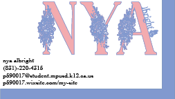
Business Card
Screenshot of My Work

1. To start my project off, I first had to create a rough design outline on the iPad using Procreate, an art software. I didn't have too many ideas, and I was worried at first. I wanted to have a really neat logo. I knew that I wanted to incorporate flowers and nature into my design, so I began by visiting dafont.com and searching for fonts in the "themed" section. After much trial, I came across "leaf" which added tiny leaf decals to every letter. As it was rather simple besides the decals, I decided to use it as a subtext or, more so, my last name. I found flower clip art off google and used it for my title font. I added the decals by saving them, changing the color, and simply layering them over the letters. I then changed the color of my first name to pink with a periwinkle stroke, and my last name to periwinkle entirely. I liked how the colors looked with each other. I also found a butterfly silhouette off google and I used it for my logo as well.
2. A cut line is what printers look for when printing out stickers. It guides them where to cut exactly to create your desired shape. It's important when creating decals for shirts and stickers because it changes the outline of it. It makes it exact. For example, if you want your logo to have a circle around it, the cutline helps you do just that.
3. Branding is what companies use to make themselves stand out in a world full of so many similar things. You can market yourself when looking for a job by pointing out and explaining your best qualities in detail as well as having a logo.
4. I believe that my project demonstrates a solid 3. As much as I would like to give myself a four, my logo looks weird when I size it down. It doesn't look that good on small business cards. I also didn't use the pen tool as I only worked with fonts, silhouettes, and clip art. I understood the project fully, though.